Website Portfolio
Case Study
Year: 2023
Software: Figma and Visual Studio Code
In this extensive case study, my primary objective is to shed light on the substantial improvements in my design choices, specifically emphasizing creativity, technical prowess, and the overall elevation of visual aesthetics in the realm of website development. A critical examination of my earlier portfolio website forms the crux of this exploration, as I meticulously analyze the inherent design flaws and missteps that characterized its initial iteration. This reflective process is essential for gaining a comprehensive understanding of the challenges encountered during the initial design phase. Moving forward, the subsequent section of this study delves into the creation and implementation of a new website, marked by a meticulous reassessment of design principles.
Providing some background context, this website came into existence during the summer of 2022. Notably, a shift in software choice marked this project, with Figma taking precedence over Adobe XD. The crux of crafting this digital space was not only to spotlight my proficiency in web development but also to underscore my diverse design capabilities, encompassing illustration, graphic design, and UX/UI design, among other creative pursuits. The website serves as a multifaceted portfolio, allowing visitors to delve into a comprehensive showcase of my skills, presenting a cohesive narrative that seamlessly integrates various facets of design expertise.
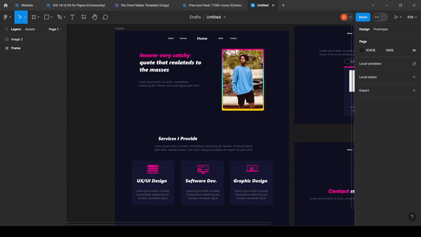
The design process for both websites followed a relatively similar path. In the case of the original website, I initially utilized Adobe XD, but for the presentation above, I transitioned the design into Figma. A notable shortcoming in my approach to the old website was the lack of meticulous planning, particularly in finalizing the layout. The presented layout diverged significantly from the actual website, with only the bottom portion of the home page bearing resemblance. The overall outcome reflected a rushed project, lacking attention to detail and coherent design systems.
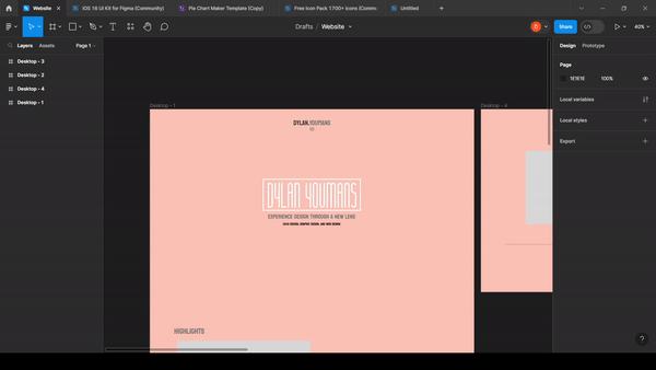
Contrastingly, the creation of the new website involved a more thoughtful and deliberate approach to finalizing the layout. The entire design process took place within Figma from the outset. Reflecting on the experience, one aspect I recognize as a potential enhancement was the incorporation of prototype animations within Figma. This could have added a touch of flair to the design, offering a clearer vision for page transitions, navigation bar movements, and other dynamic elements. Despite this, the foundational structure outlined in the Figma design closely mirrored the final execution in the new website.
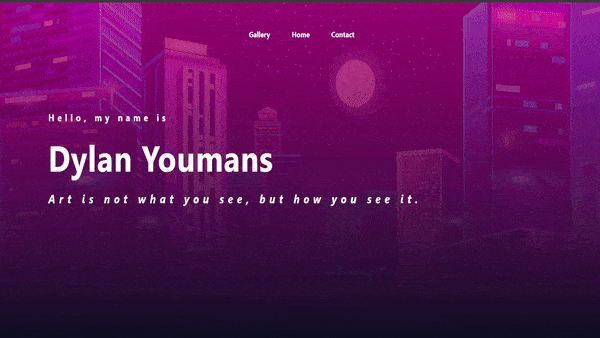
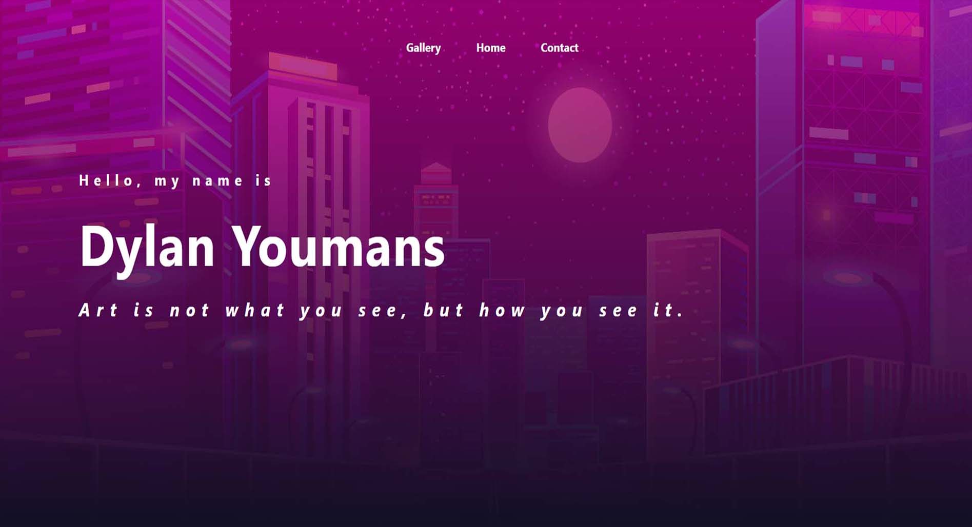
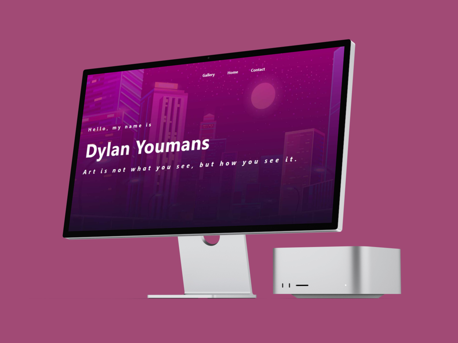
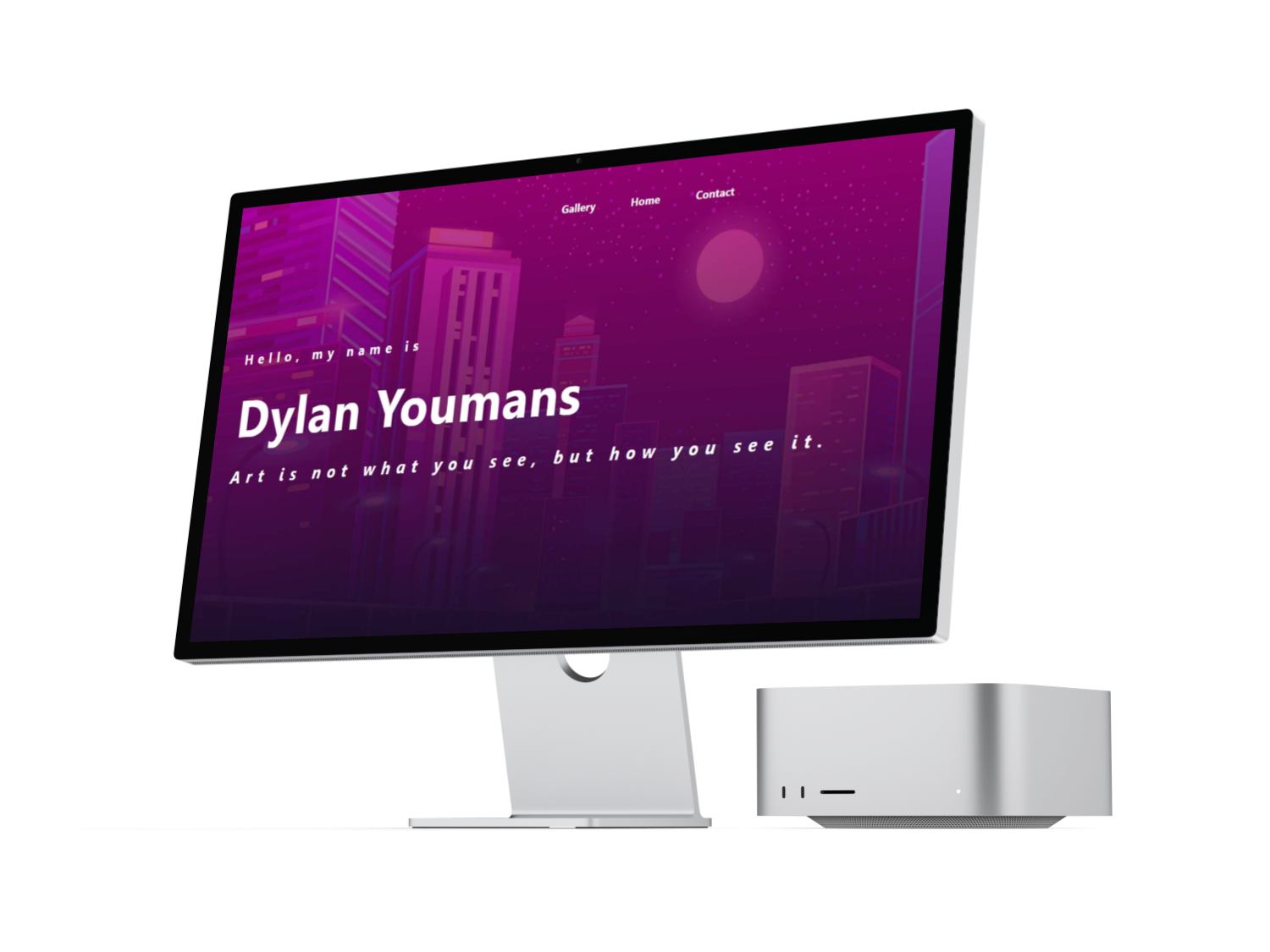
The main challenge in this project was to modernize and enhance the technical aspects of my website. A side-by-side comparison highlights the transformation from a standard front page with a background image, color overlay, and generic text to a more dynamic and engaging design. The former hero section lacked uniqueness and failed to immediately convey the website's purpose upon loading.
The goal was to create a website that instantly communicates the creator, nature of the website, and services offered, complete with service previews. Beyond functionality, I incorporated dynamic elements such as fade-ins, sliding navigation bars, and utilized Bootstrap and JavaScript for a more polished and professional feel compared to my previous portfolio website, which relied solely on HTML and CSS. This intentional fusion of a modern aesthetic with enhanced programming skills significantly elevated the overall impact of the new website.
In terms of enhancing the user interface, I focused on a couple of key improvements. Firstly, I implemented a fixed navigation bar featuring a home button that smoothly scrolls back to the top. This allows users the convenience of switching pages or returning to the top without excessive scrolling. To prevent sections from being abruptly cut off, I introduced a subtle blur effect within the navigation bar, maintaining transparency to match the page background.
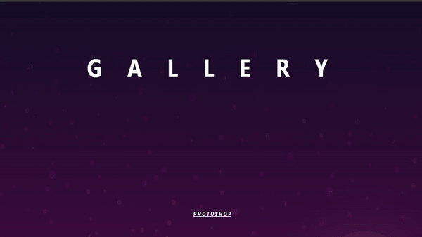
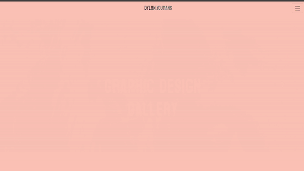
A significant overhaul was made to the gallery display for a more streamlined and user-friendly experience. In my previous portfolio, simplicity was compromised, lacking vital information about the artwork such as titles and descriptions. Additionally, the cluttered presentation and unpleasing hover animations detracted from the overall user experience.
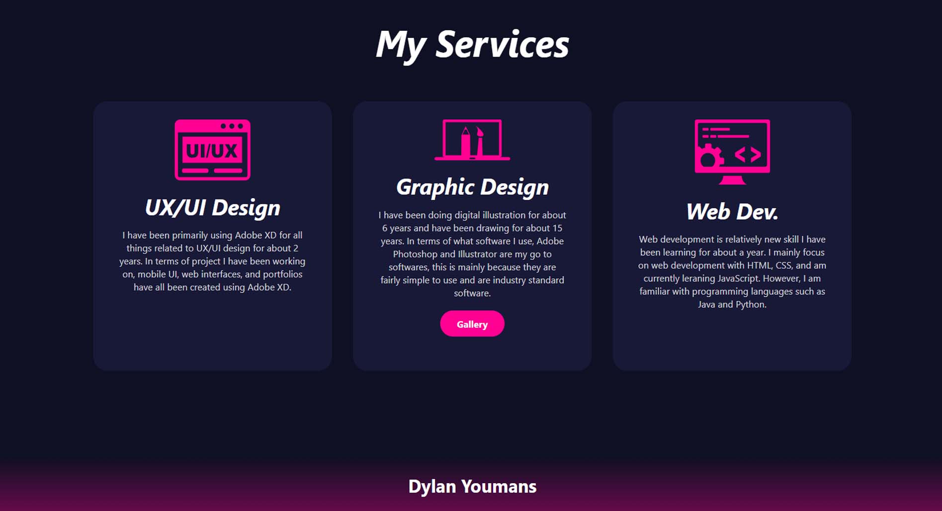
In the new design, I adopted a "less is more" approach, featuring only three high-quality art pieces with detailed information about the creative process. A slideshow preview at the top of the page adds dynamism, injecting life into the website. Furthermore, a thoughtfully designed title section enhances visual appeal. Scroll-triggered fade-in effects were incorporated to heighten interactivity as users navigate through the website.