MyFitnessPal
Case Study


Year: 2023
Software: Figma
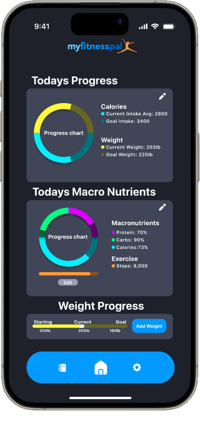
In this case study, the primary objective was to enhance the interface, infusing it with vibrancy while simultaneously simplifying the user experience by streamlining options within app sections. I'll delve deeper into these refinements later in the case study. The rationale behind these enhancements was to make the interface more approachable for beginners and to create a visually engaging experience for users. The hypothesis is that a visually appealing app is more likely to capture and retain user interest. Consequently, one significant modification I implemented was introducing color to progress bars and incorporating a variety of slides to visually represent progress, transcending the reliance on mere numbers and icons.
MyFitnessPal is a widely used mobile app and website designed to help individuals track their nutrition, exercise, and overall fitness goals. It operates within the health and wellness industry and is particularly popular for its user-friendly interface and extensive food database. Users can input details about their daily food intake, exercise routines, and health objectives into the app, which then provides insights and feedback to assist them in managing and achieving their fitness goals. The app is equipped with features such as calorie tracking, goal setting, community support, and integration with various fitness devices and apps. MyFitnessPal was founded in 2005 and has since become a go-to resource for individuals looking to monitor and improve their health and well-being.
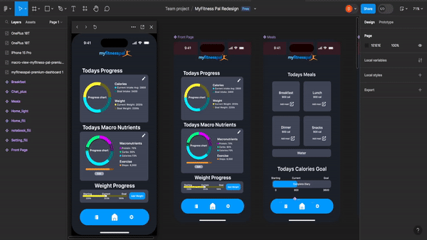
The design process for this app was notably straightforward and efficient, with Figma serving as the central tool for both application design and prototyping. This choice not only streamlined the workflow but also ensured a consistent and integrated design approach across various stages of development. Rather than opting for an extensive overhaul, I adopted a targeted strategy, concentrating efforts on specific areas identified for improvement. The main focus areas were the main page and food entry features, where careful enhancements promised significant improvements in user experience.
The primary challenge I encountered in this project revolved around becoming more adept at mobile design. While my focus has mainly been on graphic design and web development, I sought to broaden my skills in various design aspects, particularly mobile design, within this endeavor. I observed that working with a smaller interface, unlike the expansive space of a traditional desktop screen, necessitates careful consideration of available space and content inclusion due to the significant constraints in space.
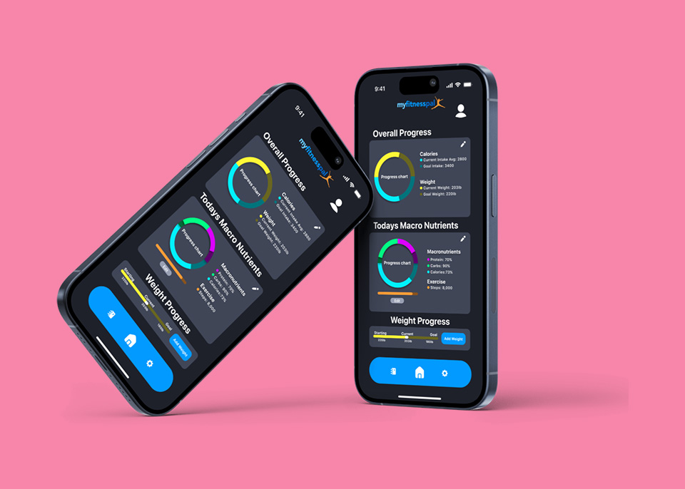
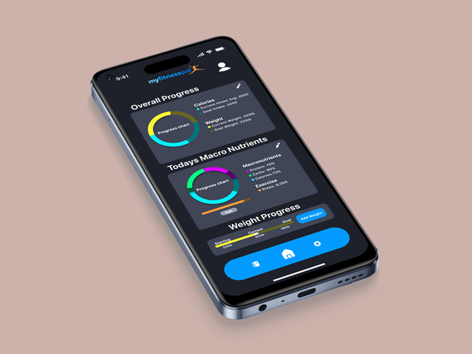
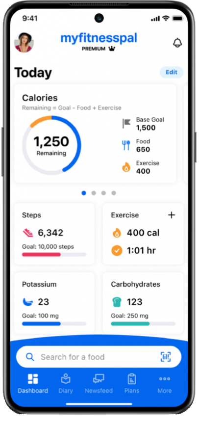
To improve the MyFitnessPal app's design, I started by looking at what I didn't like, mainly focusing on the front page and the food diary entry. I found these areas lacking in detail. The front page didn't show users' goals clearly, and there was limited visual progress. To address this, I introduced graphics and vibrant colors to make the front page more engaging.
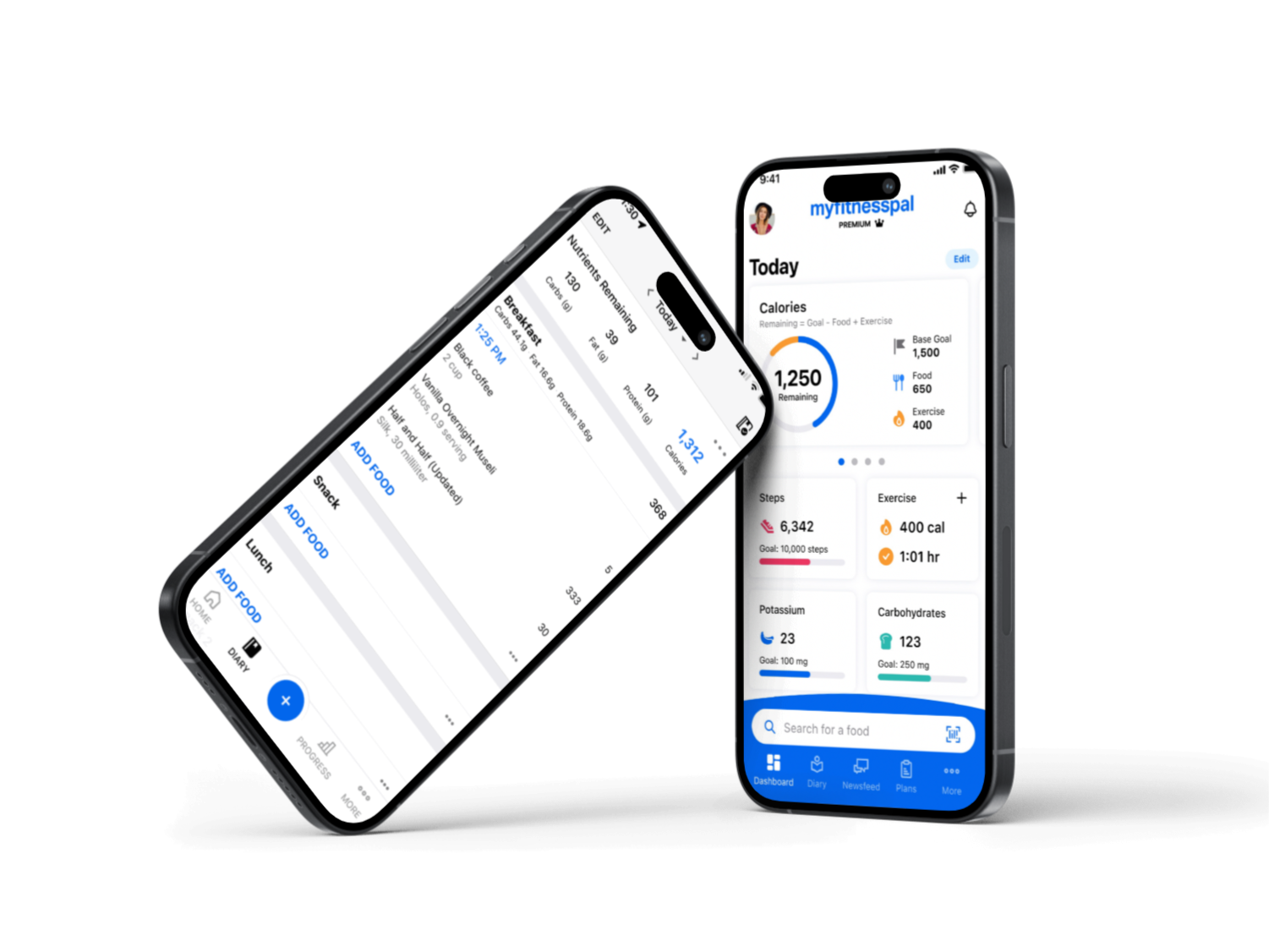
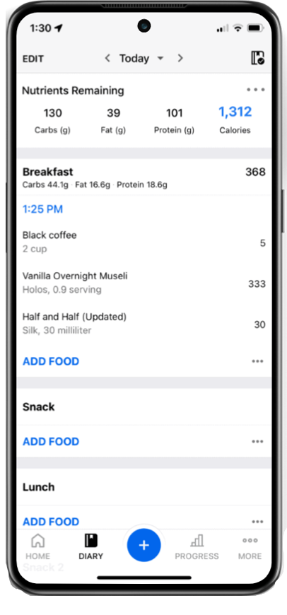
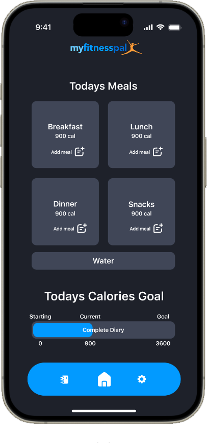
Regarding the diary, I opted for a layout where all meals are sectioned into four parts, eliminating the need to scroll extensively to log meals. This change reduces clutter, providing a clearer view of your meals. Additionally, I incorporated progress bars to visually represent your progress, moving away from a text-and-numbers-heavy approach for a more visual experience.
To enhance the counter front page, I proposed adding more graphs and progress bars. Observing visual representations of your goals provides a clearer understanding of your progress. Additionally, I opted to streamline the home navigation bar by removing unnecessary information. Now, it includes only the home page, diary, and settings. All other functions remain accessible within these categories, simplifying the navigation system and reducing clutter.
Regarding the Diary, I organized meals into four sections to eliminate the need for scrolling. This layout allows you to view all meals at once. Moreover, you can see the entire meal without having to add ingredients separately. This adjustment ensures that you only see relevant information, avoiding unnecessary details.